
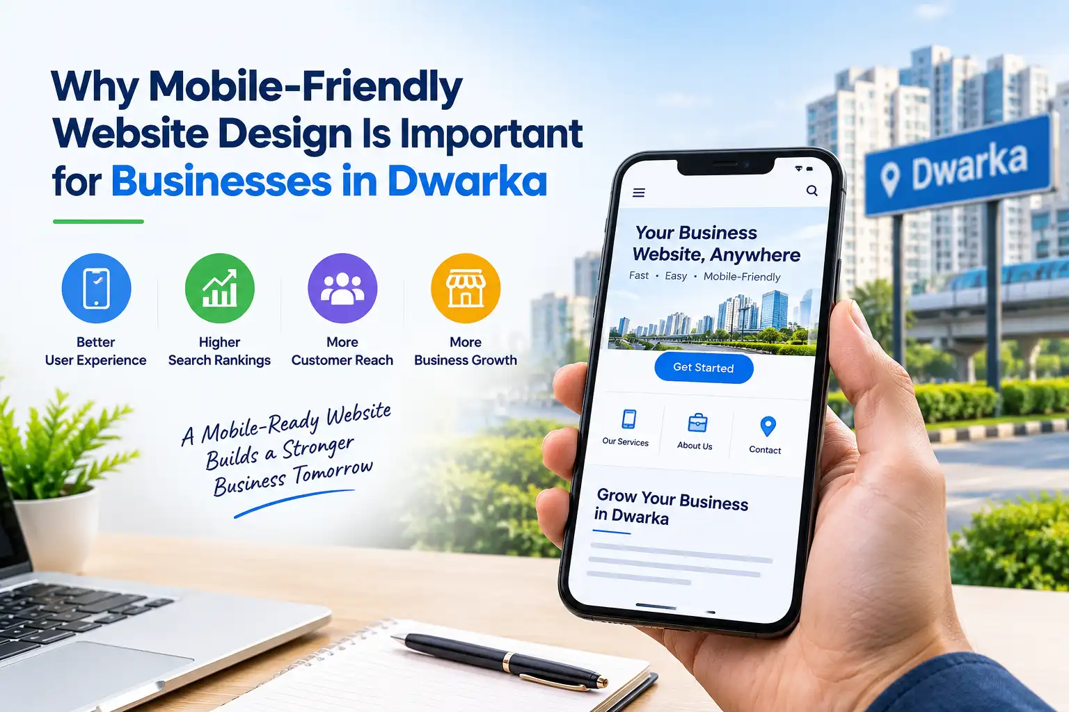
In a mobile-first world, customers often discover local businesses through smartphones before they visit a store or make a call. A Website Designing Company in Dwarka can help businesses create websites that adapt smoothly to different screen sizes, load efficiently, and make information easy to find. Mobile-friendly design is no longer simply a visual preference; it influences user experience, search visibility, credibility, and conversions. For businesses serving Dwarka, a responsive website can make the difference between a visitor staying to explore and leaving for a competitor.
A mobile-friendly website is designed to work comfortably on smartphones and tablets as well as desktops. Its layout adjusts automatically to the screen, text remains readable, buttons are easy to tap, and important information does not require constant zooming or horizontal scrolling.
Responsive web design is one of the most common approaches. Instead of creating a separate website for every device, the same site dynamically adjusts according to screen size and orientation. Good design also considers touch navigation, mobile menus, readable typography, optimized images, and fast-loading pages.
Local businesses need more than a website that looks attractive on a desktop. A professional Web Design Company in Dwarka understands that customers may search for services while commuting, shopping, or comparing nearby businesses. This makes mobile usability a practical business requirement.
A skilled design team can structure navigation around customer needs, place contact details where they are easy to access, optimize page layouts, and create clear calls to action. The goal is to reduce friction throughout the browsing journey, from the first search to an enquiry, appointment, store visit, or purchase.
The first benefit of responsive design is a smoother user experience. Visitors should be able to open a page, understand what the business offers, and take action without struggling with the interface.
Mobile-friendly layouts use flexible grids, scalable images, suitable font sizes, and touch-friendly controls. A visitor can quickly find a phone number, service page, pricing information, location, or enquiry form. When browsing feels effortless, people are more likely to explore additional pages and return later.
Mobile users are often less patient with slow websites. Large images, unnecessary scripts, poor hosting, and excessive design elements can increase loading time. A well-optimized website reduces these barriers through appropriately sized images, efficient code, browser caching, and performance-focused development.
Speed is especially important for local businesses because customers may be searching with an immediate need. Someone looking for a nearby salon, clinic, restaurant, repair service, or professional may quickly move to another result if a page takes too long to become usable.
Mobile usability and search optimization work closely together. Search engines aim to provide useful results that offer a good experience across devices. A technically sound, responsive website gives businesses a stronger foundation for organic visibility.
For a local brand, mobile optimization should work alongside location-focused content, clear business information, descriptive page titles, internal linking, and structured data where appropriate. These elements help search engines understand the website while helping potential customers understand what the business offers.
Your website is often one of the first touchpoints between your business and a potential customer. If the site appears broken or difficult to navigate on a phone, visitors may question the reliability of the business itself.
A polished mobile experience communicates attention to detail. Consistent branding, readable content, quality photography, accessible contact information, and intuitive navigation can create confidence. This is particularly valuable for businesses competing within a busy local market such as Dwarka.
The purpose of a business website is not only to provide information. It should encourage visitors to take meaningful actions. On mobile devices, this means making conversion paths simple.
A strong mobile page can place click-to-call buttons, enquiry forms, WhatsApp options, booking links, directions, or product information within easy reach. Shorter forms and clear calls to action can reduce the number of steps between interest and conversion.
When comparing the Best Website Designing Company in Dwarka, businesses should ask how the agency connects design decisions with measurable goals such as enquiries, calls, bookings, or sales.
Mobile-friendly design can make websites easier for a wider range of users. Clear headings, adequate contrast, descriptive labels, logical navigation, and properly sized interactive elements improve usability.
A mobile menu should not hide essential information behind confusing layers. Visitors should understand where they are and what they can do next. Simple navigation also supports search engines by creating a clearer website structure.
Mobile optimization does not always require an elaborate or expensive website. Affordable Web Design Services in Dwarka can focus on features that deliver practical value, including responsive layouts, optimized images, straightforward navigation, local landing pages, and strong calls to action.
The key is to avoid confusing low cost with cutting corners. A budget-friendly website should still be secure, maintainable, fast, mobile responsive, and easy for customers to use. Businesses should compare what is included in a package instead of choosing an agency based only on the lowest quotation.
A responsive website can also reduce future redesign costs because the layout is built to accommodate different devices from the beginning.
Design is only one part of a successful mobile website. The underlying development affects speed, functionality, security, scalability, and technical performance. Website Development Services in Dwarka can support the technical side through clean code, responsive frameworks, optimized media, secure forms, content management systems, and useful integrations.
Development should also reflect practical business requirements. An ecommerce website may need mobile-friendly product filters and checkout. A clinic may need an appointment form, while a service provider may need instant enquiry options.
Before launch, businesses should test pages on different screen sizes and browsers. Forms, menus, buttons, images, maps, booking features, and payment functions should all be checked. Ongoing monitoring is equally important because performance can change after updates.
Choosing the right agency involves looking beyond attractive portfolio screenshots. Ask whether the team follows responsive design principles, considers Core Web Vitals, tests across devices, and understands local SEO.
When evaluating the Best Website Designing Company in Dwarka, consider these areas:
Portfolio quality, responsive website examples, and relevant industry experience.
Page-speed approach, maintenance support, security, scalability, communication, and post-launch assistance.
A reliable agency should explain technical decisions in simple language and connect them to business outcomes. Saiway Tech can be considered when comparing providers, but the final decision should depend on capabilities, service scope, transparency, and how well the agency matches your goals.
Even a responsive website can perform poorly when basic usability principles are ignored. Common issues include tiny text, oversized pop-ups, difficult menus, autoplay media, uncompressed images, crowded pages, and forms that are frustrating to complete on a phone.
Businesses should also avoid hiding essential contact information or making users scroll through several screens before reaching a useful action. Regular testing with real devices can reveal problems that may not be obvious during desktop development.
Customer expectations continue to evolve as smartphone usage becomes a normal part of everyday life. A website that works smoothly on mobile devices gives businesses a dependable digital foundation for attracting and converting local customers.
It also creates a consistent brand experience. Whether someone discovers a business through Google, social media, an online advertisement, or a direct search, the website should deliver the same professional impression. Good mobile design therefore supports branding, local visibility, customer engagement, and lead generation together.
A mobile-friendly website is an essential business asset for companies competing for attention in Dwarka. It improves usability, supports search visibility, strengthens credibility, and creates easier paths to enquiries and sales. Working with a Website Designing Company in Dwarka can help businesses combine responsive design, performance optimization, intuitive navigation, and conversion-focused features into one reliable digital experience.
The best approach is to treat mobile design as part of the complete customer journey rather than an afterthought. When a website works well wherever customers find it, a business has a stronger foundation for sustainable online growth.
1. Why is mobile-friendly design important for local businesses?
It helps visitors browse comfortably, find information quickly, and contact businesses from smartphones.
2. Does mobile design affect SEO?
Yes. Mobile usability, page experience, and website performance can influence search visibility.
3. How can I check whether my website is mobile-friendly?
Test it on different smartphones and tablets and check navigation, text, buttons, forms, images, and loading speed.
4. Is responsive design suitable for small businesses?
Yes. It allows one website to adapt to different devices without requiring separate desktop and mobile websites.
5. How often should a business test its mobile website?
Test it after major updates and periodically to identify broken features, performance issues, and usability problems.
